
MTA New York Subway Traffic analysis
I spent my first week of Metis working on a project to analyze the movement of New Yorkers through MTA turnstile data. The objective was to help a hypothetical client, WTWY (WomenTechWomenYes) to increase attendance for their annual gala, build awareness, and to increase contributions. The client intends to place street teams at entrances to subway stations. The street teams collect email addresses and those who sign up are sent free tickets to the gala.
We focused on finding stations with most traffic, and the highest traffic day and time for the stations in order to maximize the reach. The code for the project can be found here.
The steps followed for the analysis are as follows:
- Data Extraction
- Data Cleansing
- Data Analysis/Visualization
- Recommendations
Data Extraction:
The New York subway traffic data can be found at MTA turnstile data
A look at the raw data:
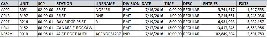
The data shows the entry/exit register values for each turnstile per control area per station for every four hours.
Data Cleaning:
Although the data looks clean, it required serious cleaning and checks.
Some anomalies and data cleaning/handling measures:
- Station name inconsistencies: Different spellings for the same station (e.g., ‘1 AV’ vs. ‘1 AVE’). Normalized the station names using the station key from MTA station list.
- Line name inconsistencies: (e.g., ‘ABC123’ vs. ‘123ABC’). Replaced line names with corresponding units to avoid inconsistencies
- Decreasing cumulative entry/exit counts:Used absolute count differences to address decreasing counts
- Impossibly large counts: Computed entry/exit rates (usual entry/ exit per sec ) to replace outlier counts with the median
- Readings off by an hour: Adjusted the off-by-an-hour counts to the nearest time
Data Analysis/visualization:
The following graph shows the relationship between the average ridership and day of week:
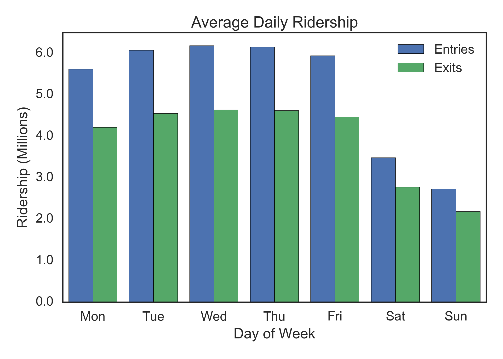
From the graph, Wednesday and Thursday seems to be ideal followed by Tuesday.
Although average ridership on weekends seems to be off by almost a million, we chose to include them in our analysis. An entirely different set of stations would be active on weekends. Also, people are usually relaxed and not rushing to work on weekends and hence, might be more receptive.
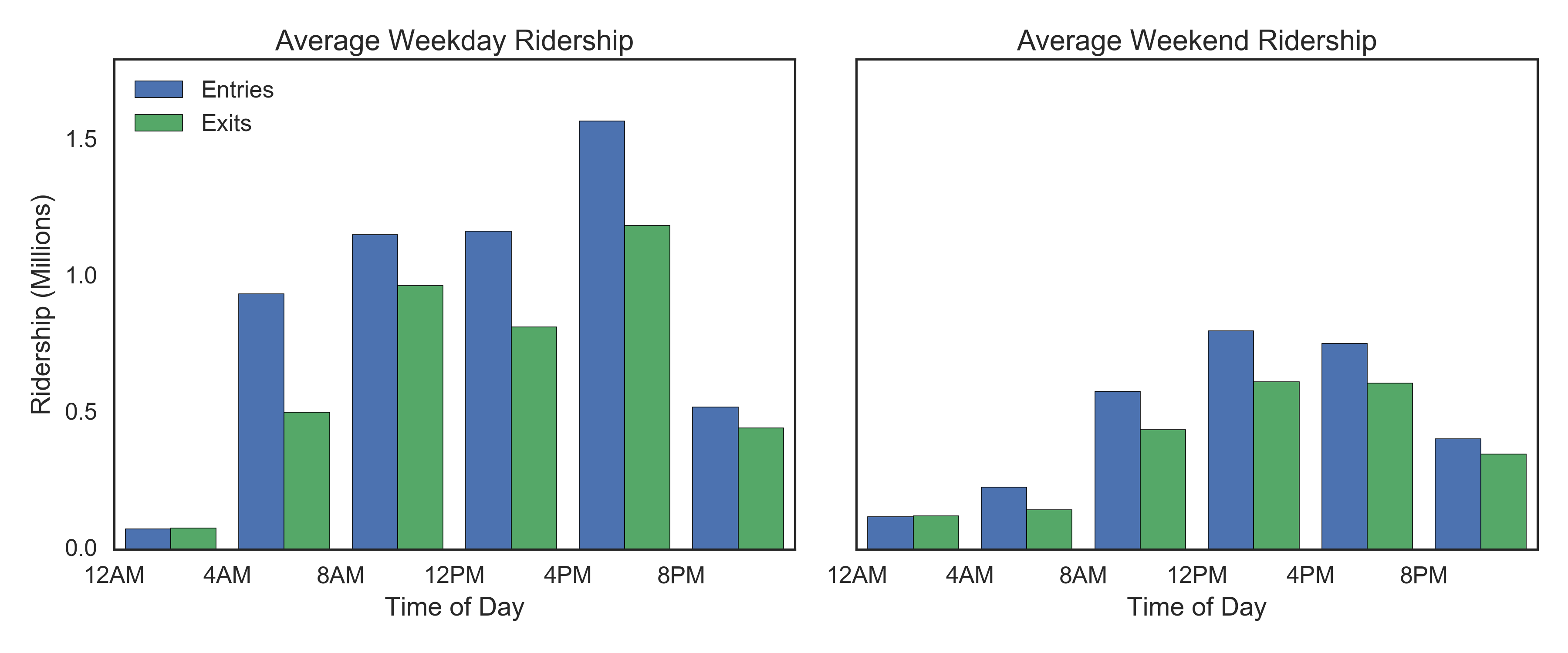
The following graph shows the relationship between the average ridership and time of the day (weekend and weekday): 4pm – 8pm seems to be the ideal spot for a typical weekday. Also, people are back from work at that time and might be more receptive. 12pm – 4pm seems to be ideal for a typical weekend.
Recommendations:
The hottest stations for a weekday are:
- 42 ST-GRD CNTRL
- 34 ST-HERALD SQ
- 42 ST-PA BUS TE
- 42 ST-TIMES SQ
- 34 ST-PENN STA
- 14 ST-UNION SQ
- 86 ST
- 47-50 ST-ROCK
- MAIN ST
- 59 ST-COLUMBUS
The hottest stations for a weekend are:
- 34 ST-HERALD SQ
- 42 ST-TIMES SQ
- 42 ST-GRND CNTRL
- 42 ST-PA BUS TE
- 14 ST-UNION SQ
- 34 ST-PENN STA
- 86 ST
- MAIN ST
- ROOSEVELT AVE
- CANAL ST
The stations are picked based on the volume of traffic. As discussed, Ideal weekday spot: Wednesday and Thursday, 4-8pm Ideal weekend spot: 12-4 pm Depending upon resources, 8am – 12pm slot and Tuesdays can be considered. And, 12pm – 4pm for weekends can also be considered. The analysis can be further extended by picking stations in areas with high concentration of technology companies. Since the event is about increasing participation of women in technology, individuals from the same background might be interested in addressing the gender gap. The list of stations can be further narrowed down by focusing on areas with women population, preferably in the age group 25-40 (Assuming women in technology companies are predominantly in the same age group). Also, individuals attending similar events can be targeted.